HOW I MADE SHIFT
A journey through my brain.
Project Overview
Timeframe: 10 weeks
Role: UX Research | UX Design
Deliverables: Mobile App | Design System | Marketing Website
Tools: Figma | illustrator | photoshop
Shift is an iOS app for on-demand work in the construction industry, connecting users with instant access to short-term opportunities.
The story
In the vibrant halls of BrainStation during Week 2 of my 12-week bootcamp, the quest for a capstone project idea was underway. As I pondered the realms of personal experiences, stories heard, and observations made, a familiar challenge emerged – the complexities of temporary work.
The problem
The temporary work force encompasses nearly 40% of millennials in the last five years yet the struggle persists in finding and accepting opportunities due to outdated platforms like Kijiji which many gig workers utilize. Cumbersome processes, complicated applications, and inadequate communication channels create a frustrating environment for both workers and employers, prompting the need for a solution like SHIFT.
The outcome
A product that instantly connects employers with skilled temporary workers in the construction industry to fill unexpected vacancies and fluctuating staffing needs.
If you’re short on time, click below :)
Process
Research
Digging for info
At the onset of the UX process, the research stage serves as a crucial foundation, delving deep into the diverse landscape of temporary work and user experiences. Through a meticulous exploration of user needs, pain points, and industry challenges, this phase aimed to uncover valuable insights that inform every subsequent design decision. By understanding the nuances of the target audience, their behaviours, and the broader market, the research stage lays the groundwork for a human-centric and informed design approach, ensuring that Shift would not only address existing problems but exceed user expectations in its final iteration.
Method One
Literature review
Informed by extensive primary research, I navigated the landscape of on-demand work, drawing insights from pertinent statistics that underscore the challenges faced by the temporary workforce. By synthesizing these statistics, I shaped a comprehensive understanding of the problem space, ensuring that Shift's development is not only user-centric but also data-driven, addressing the precise pain points encountered by both temporary workers and employers in the evolving realm of on-demand work.
Method Two
User interviews
After gaining a comprehensive understanding of the current state of the temporary work economy through my literature review, I needed to get to know the industry first-hand, through none other than those involved in temporary work. But how am I going to find these interviewees?
Well, to tell you the truth, I went on Kijiji, the most commonly used platform for temporary workers to discover opportunities. I scanned through the pages of ads, and you’ve guessed it, I started calling people who had posted “Available for work today,” “Looking for work,”and “Need somebody for work today.” After many hang ups and a lot of no’s I kept pushing through and gained a set of 10 willing interviewees.
Interview Insights
I initially considered addressing both employer and worker needs in my How Might We statement but decided to prioritize the worker's perspective based on research insights. My assumption was that solving the job discovery process for workers would subsequently address employers' labour shortages. The plan was to then iterate on the employer use case in a subsequent phase of the project.”
“
HOW MIGHT WE
optimize the process of connecting temporary workers with employers in order to improve their financial stability?
Persona
Through crafting a user persona based on interview insights and research, I aim to distill the diverse needs, behaviours, and goals of potential users into a singular, relatable character. This strategic process provides invaluable insights, fostering empathy and understanding, ultimately guiding the design decisions toward creating a product that resonates deeply with the intended audience.
Experience Map
By meticulously constructing an experience map, I endeavour to unravel the intricate user journey, pinpointing pivotal touchpoints and potential pain points. This methodical approach not only enhances comprehension of user behaviours but also cultivates a profound sense of empathy, steering design choices towards a resonant and user-centric product.
Chosen epic
User stories
User Stories serve as the narrative backbone of my design, offering a user-centric perspective that unveils the aspirations and pain points of individuals that will interact with the product. By outlining these stories, I align development with the end-user, ensuring each feature addresses real-world scenarios, resulting in a more intuitive and impactful user experience.
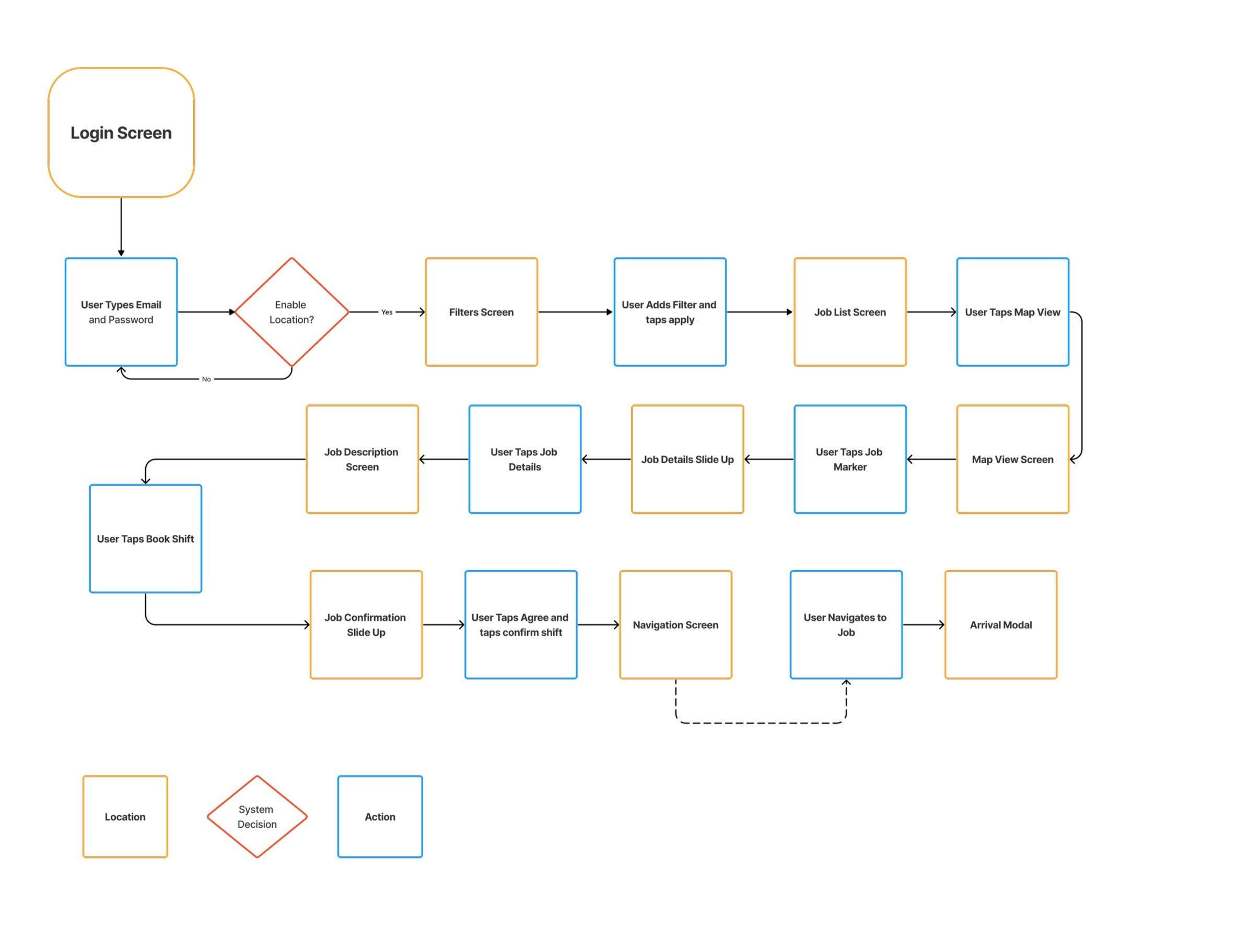
Task flow
The task flow is my blueprint of user interaction, meticulously crafted to guide individuals seamlessly through the app's functionalities. It's a strategic design map, ensuring a structured and intuitive user journey, enhancing usability and overall satisfaction. It acted as focal point to refer to later in my process when developing my prototype.
Diving into the creation of a task flow was a fascinating journey. It provided me with a concrete framework, a guiding structure that I could seamlessly integrate into my design sketches. It was also frustrating at times, learning to understand user actions, and locations, so that this structure could be applied later in my process, without having to pivot.”
“
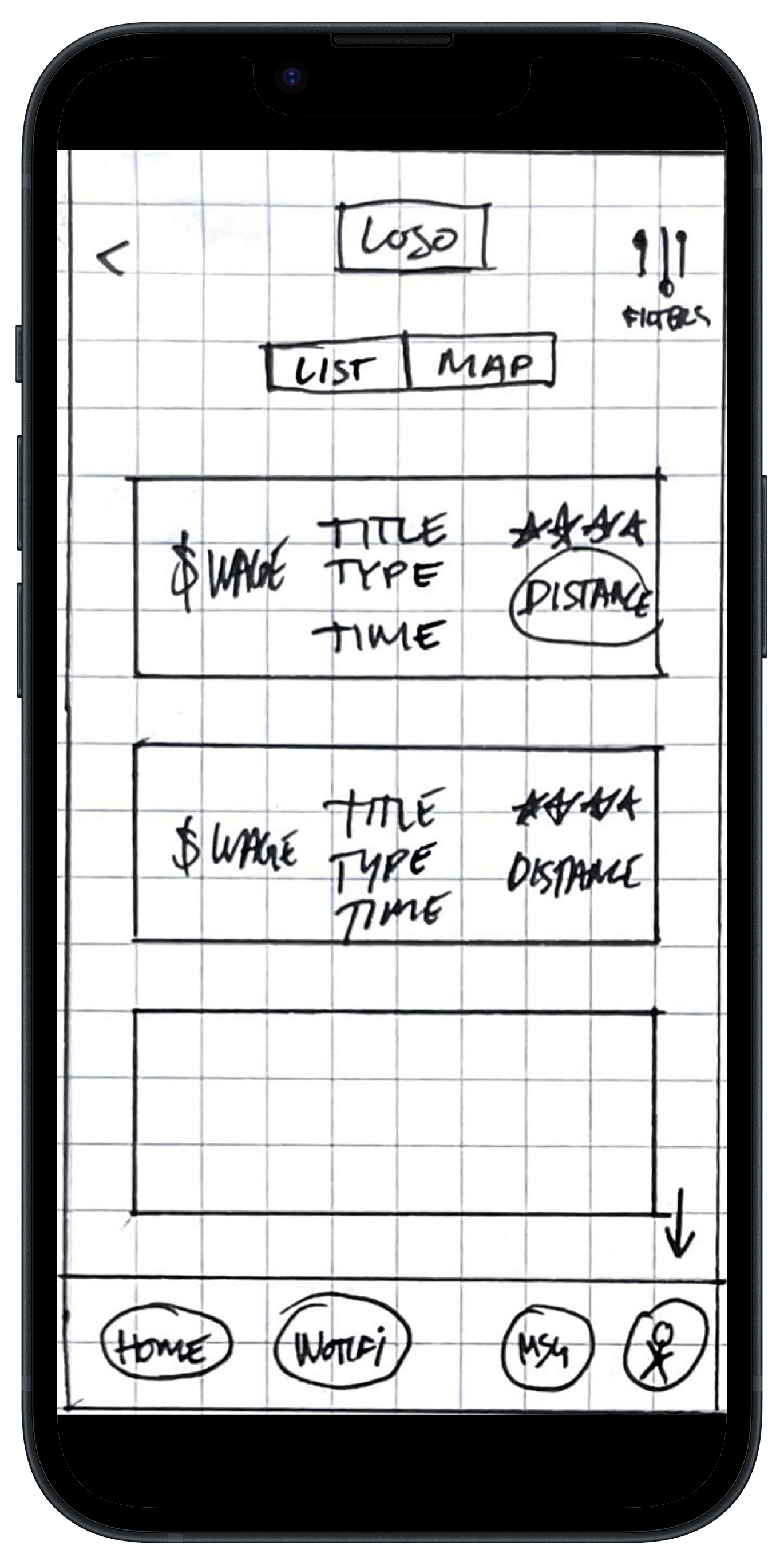
Sketchin’ ideas
Before diving into the nitty-gritty of wireframes, I kicked off the creative process with some good ol' sketching. No rules, just me and the canvas (paper, and maybe a pizza box), exploring features and layouts to discover the best solutions.
The Login
The Filters
The List View
Map View
Description
Confirm Shift
Wireframes
Transitioning from sketches to grayscale wireframes not only provided structure and clarity to the design but also offered an early testing ground before incorporating visual aesthetics. This iterative process ensures functionality is prioritized, allowing for valuable user insights and refinement before the final design stages.
Usability Testing
Testing Scenario: Imagine you are Michael, a tech-savvy millennial living in Toronto, who values the flexibility of temporary work. Today, you’re looking for a temporary job using our new on-demand work app “Shift.” I’ve recently made an initial prototype and we’d like you to navigate the app and provide feedback on how it works for you. Your goal is to find a job, and accept it.
Before
After
Feedback
Users did not understand what “Job offered by” option was. They also gave me feedback that the distance slider would be that last thing they’d like to apply before continuing to the next screen.
Action taken
I revised the filters screen by switching the distance slider to the bottom of the screen, removing the profile photo, and switching the “job offered by” menu to “how many hours do you want.”
Feedback
3.
Before
After
Users felt confused by the fact they had to return to the previous screen to remember what the wage was, and the distance from their current location.
Action taken
I realized I had left out the wage, and location causing a frustrating user experience. I replaced the employer information bar with the wage, location and amount of hours required for the job the user is viewing.
Final
“
Testing was a valuable learning experience, highlighting the importance of avoiding assumptions about user behaviour. Despite two rounds of testing, I recognized the need for further revisions, leading to a complete redesign of the job description page before progressing to high-fidelity. This crucial screen is where users engage and book shifts, emphasizing the necessity of ensuring the design aligns seamlessly with user needs.”
HOW I BUILT THE BRAND
Moodboard
Efficient: Demonstrating the app's ability to save users time and effort.
Effortless: Reflecting the ease of finding and accepting work opportunities.
Transparent: Emphasizing open and clear communication between workers, and employers.
Dynamic: Suggesting that the app can cater to the changing needs of gig workers.
Responsive: Indicating the app's quick feedback and real-time updates.
Creating a name
Who are we as a product?
Choosing the name was difficult. The name "SHIFT" was selected to encapsulate the transformative essence of the app. It signifies a shift in the traditional job-seeking paradigm, offering users the ability to swiftly navigate and adapt to on-demand work opportunities while also signifying the ability to “pick up a shift” at any given time. The simplicity of the name reflects the app's commitment to providing a straightforward and user-friendly experience, mirroring the seamless and efficient process it facilitates for users seeking temporary work.
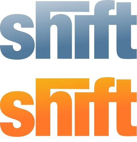
Wordmark
Creating an identity
The chosen wordmark for Shift is a deliberate blend of boldness and simplicity. Its bold typography exudes a strong and confident presence, capturing attention and conveying a sense of reliability. Simultaneously, the simplicity of the design ensures clarity and easy recognition, essential qualities for an app that values efficiency and user-friendly interactions. The wordmark aims to be a memorable and visually striking representation, aligning with my commitment to providing a straightforward and impactful user experience.
SHIFt, The resulT
An iOS app transforming on-demand work, empowering users with instant access to short-term opportunities. Redefining your work life with flexibility at your fingertips.
Marketing Website
Responsive for desktop and mobile
Design Impact
The proposed design solution for Shift proved highly effective in addressing the challenges of the temporary workforce, streamlining job access, and enhancing the overall user experience. The intuitive task flow, user-friendly interface, and seamless one-click job application significantly improved the efficiency of the job-seeking process, providing users with a powerful and empowering tool to navigate the on-demand work landscape.
did my product solve the problem?
Four Challenges I Faced
How did I solve them?
1.
Assumption Verification: The initial challenge involved recognizing the need to validate assumptions about user behaviour. Testing revealed that what was assumed might not align with actual user actions, emphasizing the importance of user-centric design.
Solution: By prioritizing user testing and feedback, I successfully validated assumptions. This approach ensured that the design decisions aligned more closely with actual user behaviours, fostering a more user-centric and effective solution.
2.
Task Flow Complexity: Crafting a seamless task flow presented challenges, requiring a delicate balance between simplicity and comprehensiveness. Iterative testing and feedback were crucial to refining the flow and ensuring an optimal user experience.
Solution: Through iterative testing and continuous refinement, I navigated the challenge of creating a seamless task flow. The result was a well-balanced flow that offered both simplicity and comprehensiveness, enhancing the overall user experience.
Redesign Necessity: During user testing, the realization that a complete redesign of the job description page was needed showcased the challenge of adapting to unexpected findings. This experience underscored the importance of user engagement points and the need for continuous refinement.
Solution: When faced with the need for a complete redesign of the job description page, I demonstrated adaptability. Embracing the findings from user testing, I responded effectively by redesigning the crucial user engagement point, optimizing the design for improved user interaction.
4.
Flexibility in Design Direction: The overarching challenge involved maintaining flexibility in design direction. The iterative nature of the process demanded adaptability to changing insights, user feedback, and the evolving understanding of the problem space, emphasizing the importance of a dynamic design approach.
Solution: My ability to maintain flexibility in design direction became evident as I navigated through evolving insights and user feedback. Embracing a dynamic design approach allowed me to respond to changing requirements and refine the solution iteratively, ensuring its relevance and effectiveness.
Future Thinking
The tarot cards of tech
My majority user base is those who prefer to work on their terms, without a strict schedule. They don’t like to be held down. But wait, what about a user who wants to find something more stable, maybe permanent?
This is interesting to sit back and contemplate. I’ll be right back.
Hi, okay so I thought about this, deeply. The experience of a user who wants something more stable might be frustrating on Shift. They pick up a job for a day, then it ends, and what about tomorrow? They might feel a deep rooted insecurity from this. Could we offer a feature that allows employers to offer a full-time more regular job with them? Maybe we need to explore this perspective, after all we’ve got a great product for those who WANT a sense of freedom, but there’s a whole other user being left on the sidelines. They may want to continue working with an employer who is interested in their skill set, their work ethic.
Now thinking about my core user base, what if the opposite of what I’ve come to know was true? Would we have a product? The simple answer is we wouldn’t. Shift would need to pivot and be a job placement product that serves those looking for a new permanent job. We would need to refocus the job acceptance feature to be an application that allows employers to follow a more traditional hiring paradigm.
Interesting stuff, I’d say.
What did I learn overall?
Key Learnings
1.
Human-Centric Design is Paramount: The journey of building Shift underscores the critical role of human-centric design. Prioritizing the needs, behaviours, and goals of users at every stage ensures a solution that resonates deeply with the target audience, enhancing overall user satisfaction and usability.
2.
Iterative Testing Enhances Solutions: The iterative testing approach emerged as a key learning. By continuously testing and refining the design based on user feedback, Shift evolved into a more effective and user-friendly solution. This methodology ensures that the final product aligns closely with user expectations and preferences.
3.
Adaptability and Flexibility are Crucial: The need for a complete redesign of the job description page highlighted the importance of adaptability when designing any product. Being flexible in design decisions and embracing changes based on user insights allowed for quick and effective responses to challenges, resulting in an improved overall user experience.
Dynamic Design Approaches Yield Success: My embracing of a dynamic design approach throughout the process showcases the effectiveness of responding to changing requirements. This flexibility allows for ongoing refinement, ensuring that Shift remains relevant and aligned with user needs, even as the project progresses through different stages.


